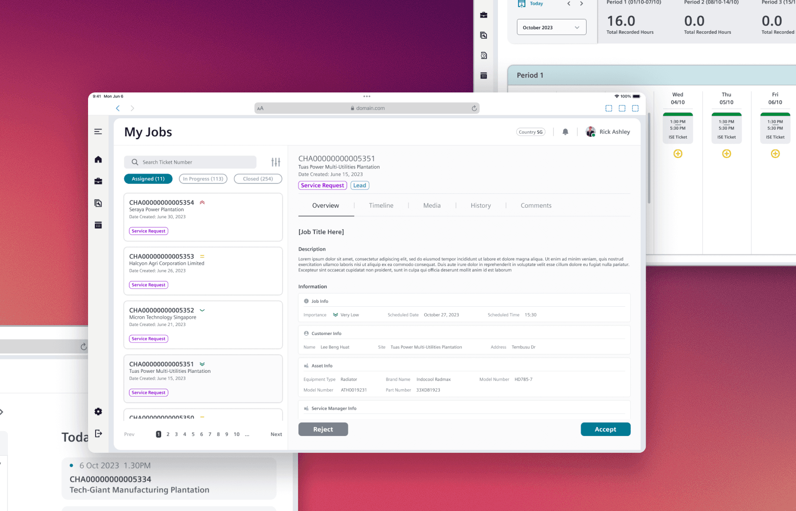
A centralised platform designed to connect factories and their internal workshops, allowing teams to monitor daily and historical performance metrics. It also functions as a communication hub for important announcements—bringing visibility and alignment across operations within a single, unified interface.

Nissan is a global automotive manufacturer headquartered in Japan, known for its commitment to innovation, quality, and sustainable mobility. With decades of experience in manufacturing and engineering excellence, Nissan operates a vast network of factories and production lines worldwide. The company continuously invests in digital transformation to enhance operational efficiency, including the development of in-house tools to monitor performance, streamline workflows, and support data-driven decision-making on the manufacturing floor.
This project is part of a complete overhaul of an existing legacy system used by Nissan’s headquarters, factory managers, engineers, and QA personnel. The redesigned platform - Quality Control, Quality Reassurance (QCQR) - supports end-to-end oversight by capturing workshop transactions, tracking productivity, and enabling traceability of car parts throughout the manufacturing process, ensuring faster issue resolution and higher quality standards.
Company
Nissan, Japan
Industry
Car Manufacturing
Timeline
June 2024 - Dec 2024
Software Development Life Cycle
Agile Methodology
Platform
Desktop Web App
Role
Lead User Experience Designer
I led the UX and product design efforts from the proposal stage through to final implementation. This included understanding the legacy system, conducting user research, ideating and prototyping, and building a scalable design system. I worked closely with the Business Analyst, Project Manager, engineers, and client stakeholders to ensure a smooth and effective redesign that met user needs and business goals.
Team
01 Project Lead
01 Project Manager
01 Business Analyst
01 Lead User Experience Designer
01 User Experience Designer
01 Software Architect
04 Developers
02 Project Team Members


MY DESIGN APPROACH
My approach focused n creating a modular and intuitive solution that balances complexity with ease of use. The goal was to support complex operational requirements through a scalable design system, while ensuring the platform remains user friendly. I also designed with future growth in mind, enabling the platform to adapt as additional factories and workshops are onboarded.
Who are we solving or?
The development of the Quality Assurance & Quality Control (QRQC) application is mainly for factory managers and workshop engineer to streamline data input and improve analytics efficiency.
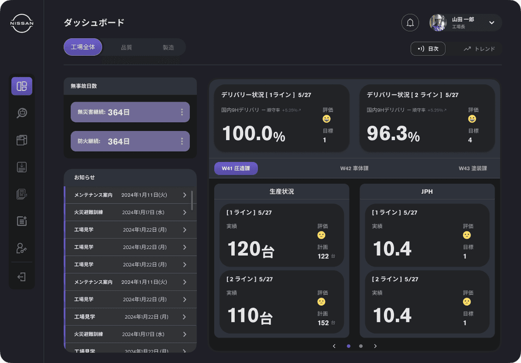
QRQC dashboard mainly focus three key categories: Factory, Quality, and Safety, emphasizing quick access to overall factory performance insights.
These include daily performance trends, KPIs, and historical data across multiple time periods.
What are we solving?
The dashboard displays a large amount of data, including real-time KPIs and metrics from different time periods. Showing everything in one long scroll creates visual clutter and makes it hard for plant managers and engineers to find key insights quickly. This slows down decision-making, and as more data and features are added, the usability issues are likely to grow.
What are the end goals?
Provide end-to-end traceability of car parts across the manufacturing process
Centralize workshop transactions and performance tracking into a single platform
Improve usability and workflow efficiency across engineering, quality assurance (QA), and factory teams
Enable faster identification and resolution of production issues
Support data-driven decision -making through better visibility and reporting
Align with modern UX standards and scalable system architecture
Ensure the platform meets both operational requirements and long-term business goals
Information Overload
Dashboard displays excessive data in a single view, leading to visual clutter.
Poor Usability
Excessive scrolling is required to access key information, slowing down workflow.
Cognitive Strain
User experience cognitive overload trying to interpret and prioritize mixed metrics.
Scalability Risk
The problem is expected to worsen as more data and features are added over time.
Workflow Disruption
Plant managers and engineers can't quickly access daily KPIs critical to operations.
Decision Bottlenecks
Slower access to insights leads to delays in addressing manufacturing issues.
Initial design strategy under uncertain requirements
When the project was first presented to me, the features and requirements where still largely undefined. However, the project lead requested wireframes to be prepared for an upcoming client proposal. Drawing from my past experience with KPI trackers and dashboard designs, I made informed assumptions about the essential components typically required.
To align expectations, I also consulted with the project lead to determine the appropriate user level to design for. We agreed to begin with an initial design focused on management-level users, as their needs would help establish a high-level framework for the platform.
Dashboard
Case ticket management
Pipeline


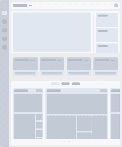
INITIAL DESIGN REVIEW
During the design review, the project manager provided clearer definitions of the required features - particularly for the dashboard. We reviewed the layout and discussed the design intentions behind each screen. Together, we identified key areas to prioritize and move forward with, translating them into high-fidelity wireframes for the client proposal.
PROPOSAL FINAL DESIGN
A combination of grid-based, tabbed, card, and tile layout was adopted to balance versatility, modularity, and clarity.
This hybrid structure enables users to easily navigate between datasets, view high-priority KPIs at a glance, and drill down into detailed analytics.


The final design successfully secured client approval, as they were highly receptive to the proposed concept. With the proposal accepted, we moved forward to the next phase - preparing for user interviews to validate and refine our design decisions..
UNDERSTANDING THE USER
Analyzed the tasks and daily workflows of core users to identify what they need from the app across different factories and workshops.
Defining the user's needs
The QRQC platform is designed to support a wide range of users across five manufacturing factories in Japan. For the initial phase, we focused on onboarding the Tochigi factory, which includes multiple departments and a variety of user roles.
To accurately define and classify these user types, I collaborated closely with the project manager, business analyst, and local project team members in Japan. Together, we identified and mapped out the different user groups based on their departmental functions and workflow needs.
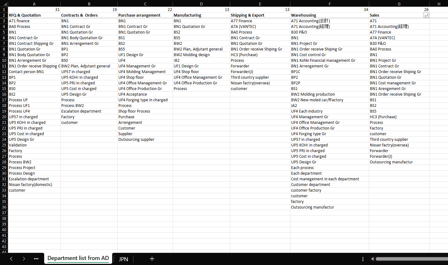
We classified each user into their departments respectively:
RFQ & Quotation
Contracts & Orders
Purchase Arrangement
Manufacturing
Shipping & Export
Warehousing
Sales
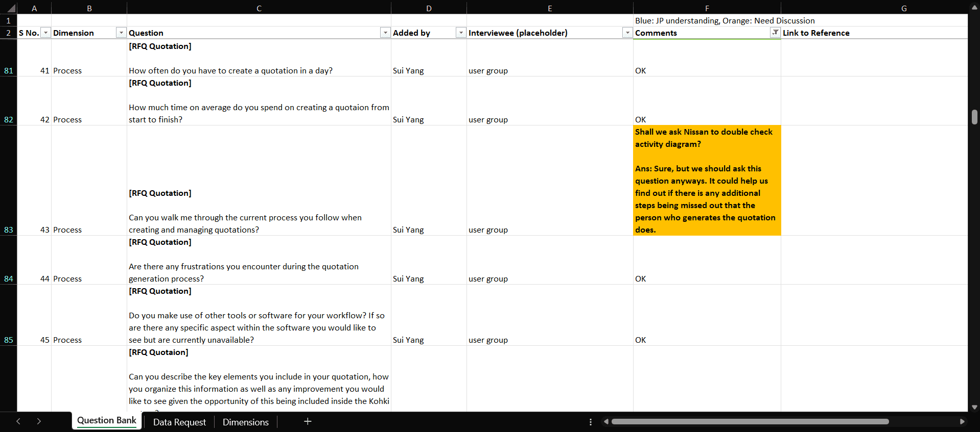
Preparing for user interview questions
After defining the key user groups within the factory, we proceeded to prepare a structured question bank for upcoming user interviews, which would be conducted by the Japan department.
Given the wide variety of roles across departments, we organized questions based on several key dimensions to ensure targeted and relevant questioning. This classification helped streamline the interview process and allowed us to uncover specific needs, pain points, and workflows unique to each user type.
Documentation
Goal and Pain Points
Process
Reporting
System
RESEARCH RESULTS & FINDINGS
Conducted an in-depth analysis of the user's workflows and the legacy application to uncover inefficiencies and pain points. Insights gathered were classified and prioritized to determine which areas to focus on. These findings were then used to refine the initial design and ensure that the proposed solutions directly address the most impactful user needs.
Manual data entry into Excel, from the legacy application is still required to generate insights.
Graph are manually created in Excel, often difficult to interpret - though users have grown accustomed to this.
Information dissemination to factory workers is limited, reducing visibility and alignment across teams.
Daily KPIs are incomplete, as the legacy app does not provide the full range of data users want to track.
No centralized location to upload or manage datasets, leading to scattered and inconsistent data handling.
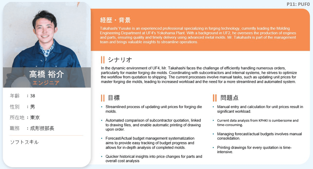
USER PERSONAS


DEFINING OF FEATURES
What will be the focus?
After completing the user interviews and user personas, we aligned with the client to determine which user group to prioritize. Since the initial rollout targets the factory manager and engineers at the Tochigi factory, we focused the next phase of the design on features that specifically support their operations.
Historical Graphs displaying performance trends across workshops within the factory
Daily KPIs tailored to the specific needs of Tochigi's workshops
Data Upload Section for importing datasets and storing information used in graphs
User Management to handle roles, permissions, and account configurations
Bulletin Board feature for posting internal announcements and updates.
DEFINING OF FEATURES
In collaboration with the project team and business analyst, we gathered all necessary requirements and KPIs specific to the Tochigi factory. Together, we defined how each KPI would be visualized within the dashboard.
What are the requirements?
The next collaboration was with the clients to identify key area of focus they would like to see. After discussion, we aligned on two primary domains to prioritize for the current phase:
Production
Quality
These would guide the development of deeper insights and data visibility tailored to their operational goals.
What are the KPIs?
Once the key focus areas were confirmed, we worked on identifying the exact KPIs required by the client. From there, we carefully determined the most effective graph types and visualization methods to present each KPI clearly and intuitively within the dashboard.
Bar Graphs
Stacked Bar Graphs
Pareto Graphs
Line Graphs
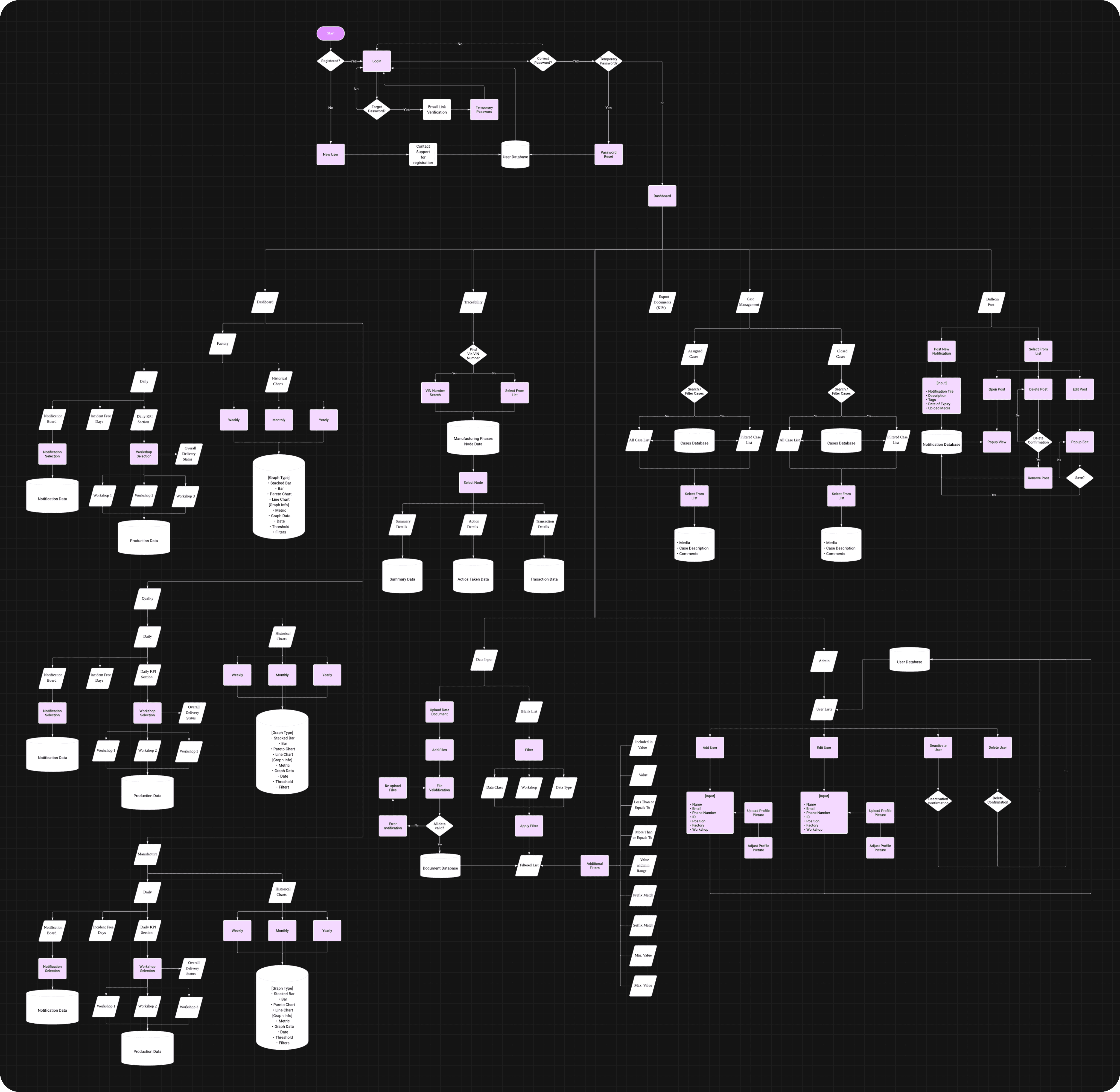
USER FLOWS
Defined clear user flows to map how users navigate through the application to access key information and data efficiently. This ensured a logical, intuitive experience aligned with their daily tasks and decision-making processes.
IMPACT CREATED
Below we have the finalized design for QRQC catered to the Tochigi factory. I will be breaking down each element within the app, explaining their purpose and how they will help improve the workflow for the users.
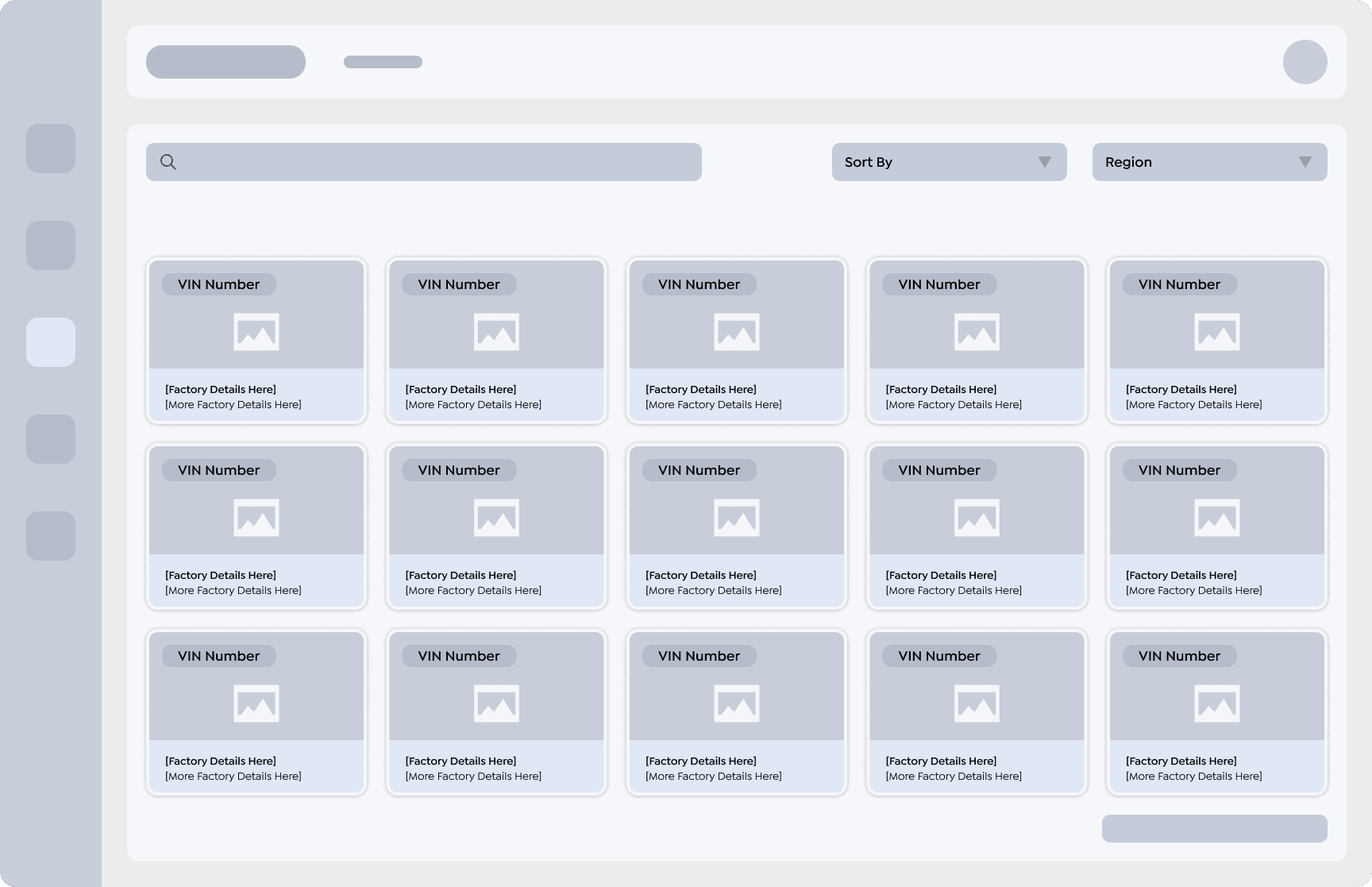
FEATURE 01
QRQC's Dashboard
This dashboard consist of both daily and historical data. Each category "Production" & "Quality" have each have their own tab to toggle between daily live data and historical data.


When this section of the dashboard is toggled, users gain real-time visibility into their factory’s performance metrics, enabling quicker insights and faster decision-making.
Incident Tracker - Logs daily work accidents or fire accidents.
Bulletin Board - Displays announcements from management
Line Performance - Show production rates by factory line.
Workshop KPIs - Displays KPIs based on selected workshop

DESIGN RATIONALE
Dashboard Segmentation Decision
Initially, both live and historical data were displayed on a single dashboard to centralize information. However, with future scalability in mind—especially the addition of more graphs—it became clear that this approach would lead to excessive scrolling and visual clutter.
Additionally, historical trends require their own timeline filter, which could cause confusion if placed alongside a real-time data feed.
To solve both issues, I segmented the dashboard into two distinct tabs: one for live daily metrics and another for historical data. This separation improves clarity, usability, and scalability for future growth.
Factory Line Placement Logic
Since the production line in a car manufacturing factory physically runs through each workshop, its performance data is relevant across all workshops. To reflect this, it is displayed above the workshop filters rather than grouped with individual workshop KPIs.
Workshop KPI Layout Inspiration
The Workshop KPI section was inspired by audio buses in digital audio workstations, where plugins of varying sizes are modularly arranged in rows. This layout supports flexible KPI display types and future scalability as the platform expands to new factories globally.
FEATURE 02
QRQC's Bulletin Board
Posting and editing of announcements for management to disseminate information to on the ground engineers.

DESIGN RATIONALE
Tags
As the number of workshops grows, using tags allows management to classify posts effectively and control which teams or workshops receive specific announcements, ensuring clear and targeted communication.
Post Expiration
During discussions with the client, it was highlighted that posts should expire automatically. While the development team proposed a standard expiration duration, I recommended providing users with control over the expiration date, allowing flexibility for special cases or time-sensitive announcements.


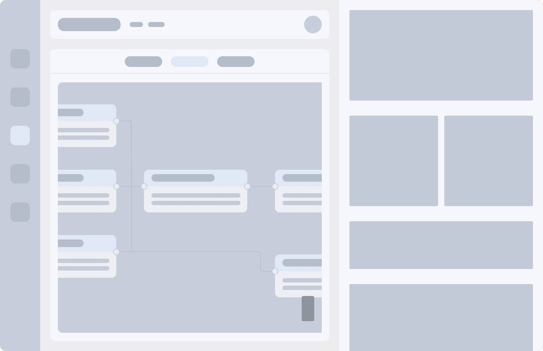
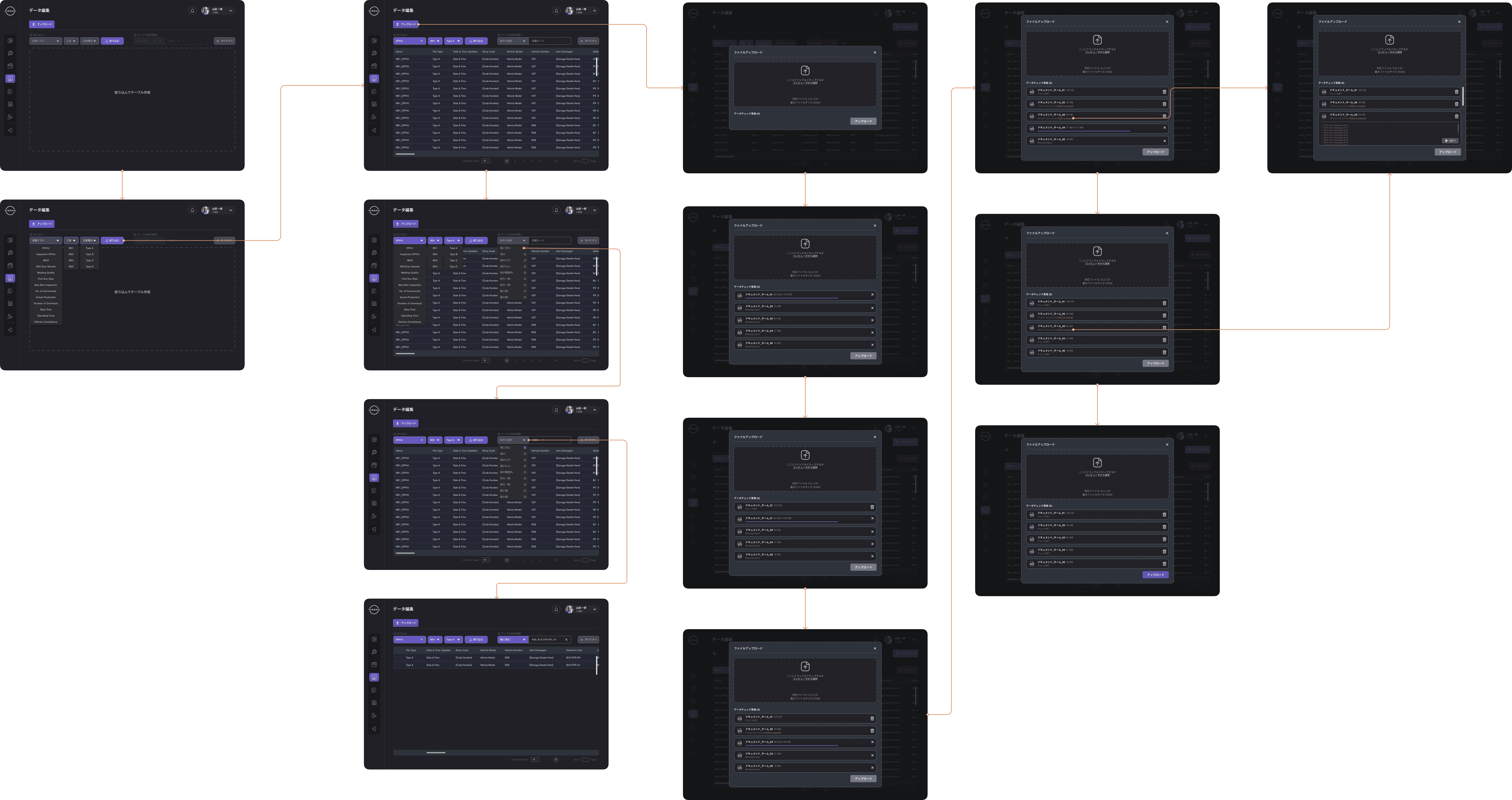
The data input page will not display any datasets until the user applies the necessary filters.
Document Class - What is the document classified under.
Workshop - Which workshop does the document belong to.
Document Type - What is the type the document is grouped under.
Advanced Filter - Provide users with advanced options for more refined searches.
Clear All Filter
DESIGN RATIONALE
Why data only appear after filter?
During requirements gathering, I discovered that the system needed to handle 13 distinct document classes, each with variations in headers and column counts. Displaying all data at once would lead to performance issues and an overly extended table.
To address this, I conducted research to identify commonalities and proposed a three-level grouping system: by document class, workshop, and document type. This structure allowed us to load only relevant data after users applied a primary filter, ensuring both performance and usability.
Some project members initially questioned this approach, but I explained that without a filtering step, the user experience would suffer due to excessive loading and visual overload.
Advanced Filter
Designed to let users refine results further by entering specific values or keywords using set conditions after the initial filter - essential for managing large datasets that grow over time.
Value includes
Value is
Value is less than or equals to
Value is greater than or equals to
Value is within range
Prefix match
Consistent with
Minimum value
Maximum value
This phase verifies that uploaded documents contain the correct fields and inputs, serving as the first line of defense against human error and ensuring data integrity from the start.
Upload Section - Allow drag and drop and specify file type and size limit.
Validation Progress Bar - Provides visual feedback to reassure users that the validation process is actively running and not stuck.
Error Messages - Displays specific error locations within the document, helping users quickly identify and correct issues without manual debugging.
DESIGN RATIONALE
Since data management was a key concern raised by the client, optimizing the upload process became a priority. During user interviews, many highlighted frequent human errors when uploading data in the legacy system.
In addition to enabling in-app data editing, I proposed implementing a backend validation layer that checks each document for accuracy before it’s accepted into the system. This added safeguard helps ensure cleaner, more reliable data from the start.
Error Messages
We introduced a nested, expandable error display after recognizing that simply alerting users to an issue wasn’t enough - especially for large documents where manually locating errors would be time-consuming. To avoid clutter, the error details are housed within a collapsible section inside each data card, offering clarity without overwhelming the interface.
FEATURE 04
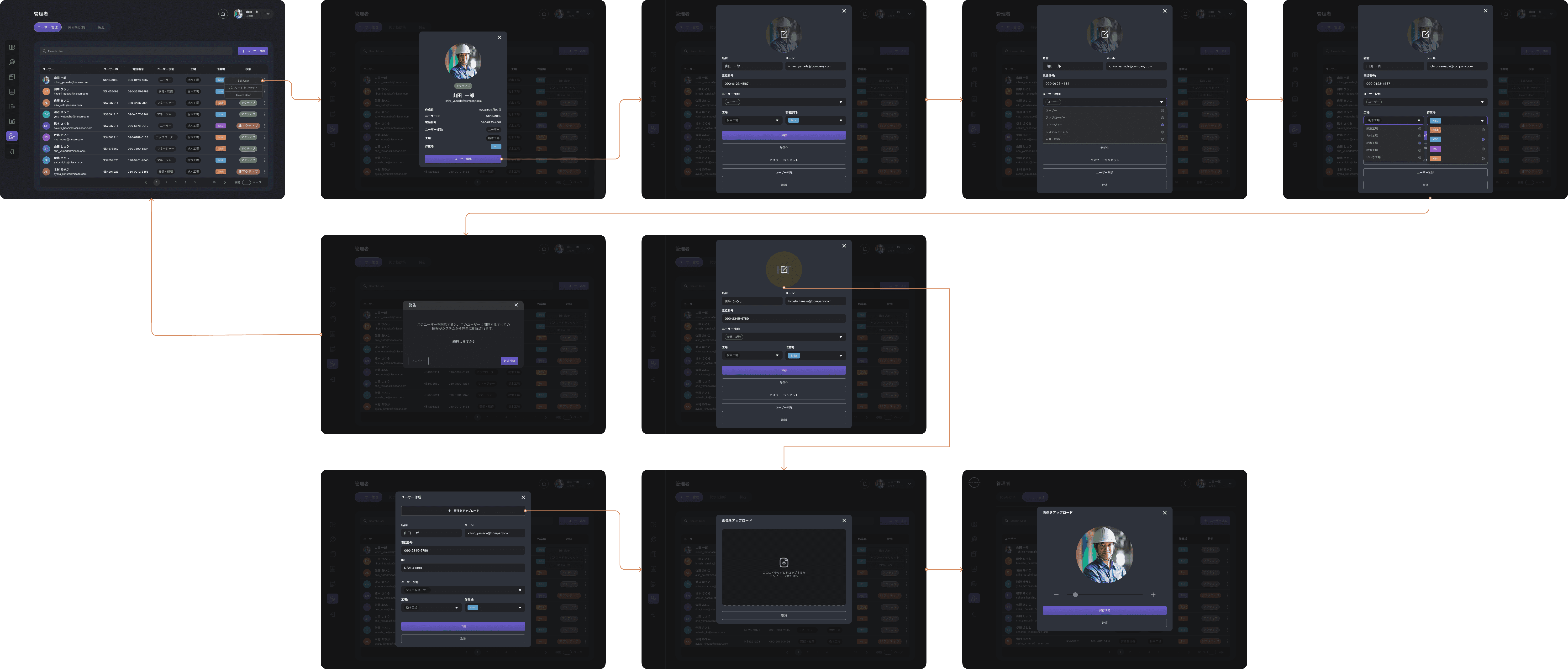
QRQC's User Management System
One of the most important features to have as it is used to manage user accounts
DESIGN RATIONALE
The design for the user management section was intentionally kept straightforward to support the daily needs of factory management. I began by identifying the most essential data points they would need quick access to—such as employee name, email, department, and role.
To improve readability and reduce the need for excessive horizontal scrolling, I grouped related information (e.g., name and email) within the same row. This helps maintain a clean layout and ensures that critical information is immediately visible at a glance.
In addition, since engineer classification and departmental grouping were important to the client’s workflow, I incorporated filtering and tagging functionalities to allow management to easily sort and manage employees based on their assigned workshops or roles.
The goal was to strike a balance between data density and usability, ensuring the interface can support both quick overviews and more detailed user management tasks—without overwhelming the screen or the user.
KEY TAKEWAYS
Reflection on project outcome
This project involved designing a comprehensive solution for a Japanese client, with most communication taking place indirectly through internal stakeholders due to language differences. The project was carried out under tight timelines, and while the client expressed strong satisfaction with the design work, I encountered several challenges during the design process — including limited direct feedback, feasibility uncertainties, and coordination gaps across teams. These experiences taught me valuable lessons in managing complexity, communication, and collaboration within cross-functional environments.
Navigating language & cultural barriers sharpens communication discipline. Working with a Japanese client through intermediaries taught me to be especially clear, concise, and intentional in how I documented design decisions. I learned to anticipate potential misunderstandings and present designs in a universally understandable way (e.g., using annotated visuals and design logic that can stand alone).
Indirect communication channels require over-communication and visual clarity. Because most feedback was relayed second-hand, I had to ensure my designs could communicate for themselves - through detailed annotations, clear flows, and rationale that didn't rely on verbal explanation. This strengthened my ability to create self-explanatory design assets.
Client satisfaction is often built on transparency and consistency. Despite the communication and development hurdles, I was able to gain the client’s trust by consistently delivering designs that addressed their needs and following through with clarity. Their positive feedback showed that trust can still be built even when collaboration isn’t ideal.
Managing feasibility uncertainty required adaptability and collaboration. Many features had unclear technical constraints. I learned to collaborate with developers early and often to assess feasibility in parallel with design - iterating based on real-time input and keeping flexibility in mind.
Stakeholder alignment takes more effort across language and time zones. Coordinating with cross-border stakeholders taught me to prepare more structured updates, summaries, and visual documentation in advance. I also learned to ask specific, targeted questions to avoid miscommunication in delayed or asynchronous replies.